Today on the first installment of "Design Philosophy," we're going to look at the designs revealed in teasers for the Power Rangers and Rita Repulsa for the 2017 Power Rangers, and compare them to their originals.
I should probably start off by saying that I'm not that big of a Power Rangers fan - like a terrible boyfriend, other things like Power Rangers may catch my interest for awhile, but I always end drifting back to Transformers. But I did get into PR for a little while, and design is design, whether or not you're a fan of it, so I think I should be okay to make this post.
Fingers crossed!
Let's dig right into it.
(Comparison image of the 1990's originals with their 2017 counterparts. Source:
screenrant)
The original costumes were simple and straightforward. One dominant color, gloves, boots, and a white diamond on the chest to break it up, and then a helmet with some details to suggest an animal. It's simple. They were going to sell toys, and the producers of the original weren't trying to deliver an amazingly complex visual experience like Christopher Nolan's
Inception. They were simple, and (I assume) easy enough to move around to deliver a high-flying stunt kick while hung up on wires.
I appreciate them they're trying to keep the costumes looking like their classic versions as much as they could while also modernizing them, but what they've done with Rita makes me wonder if it was the best choice. The new costumes are
incredibly visually busy, with lots of glowing lines and a bulked-up appearance suggesting armor. The way they achieve that, though, is to the costumes' detriment. No longer are the boots and gloves simple block colors at the end of their appendages; they're now armored boots and gauntlets, with swirls and curls and elaborate designs on them.
The shoulders are layered, there is a spot of color running down the waist, and the white diamond on the chest is a purple shield-like insignia. The layering on the shoulders adds yet more details, and more colors and more ridges which break things up further on the costume, requiring more time to for the viewer to see and to process and breaking up the colors even more, and not in a way that works to the costume's benefit.
The belt buckles on the originals were little more than squares with the insignia on them across a white stripe running along the waist on the originals, but here, they're these almost impossible to make out glowing circles which sort of fade into the the midsection, but not quite enough to completely disappear, so they become these distracting little divots in the design.
It's a lot to visually process.
It looks cluttered, unlike, say, The Marvel Cinematic's Universe Iron Man.
(Iron Man and War Machine in Civil War. Source;
moviepilot)
One dominant color, the red, which breaks up in small, solid chunks, without all the curling and swerving of the Rangers' costumes. There's only four colors, and one of them is almost non-existent. There's silver patches, but they're small, and they ultimately take up less space on the costume than the gold, which is itself done in small amounts on smaller surfaces of the costume - the sides of the waist and around and on the outside of the shoulders, And the other bit of color - the glowing blue lights - are even smaller, set within the center of the chest and just beneath the shoulders, where they blend in and don't distract you. You process it easily, once and then move on - a big block of red with some gold and silver on it, and an almost-invisible teeny dab of blue.
Now, the Rangers' costumes could look better in motion, with CGI and debris flying all around, and they're not necessarily final, but for now it looks, well ... "cluttered" is really the best word for it, and for that reason, I rank these new Ranger costumes as not well-designed.
Design Verdict:
Poor!
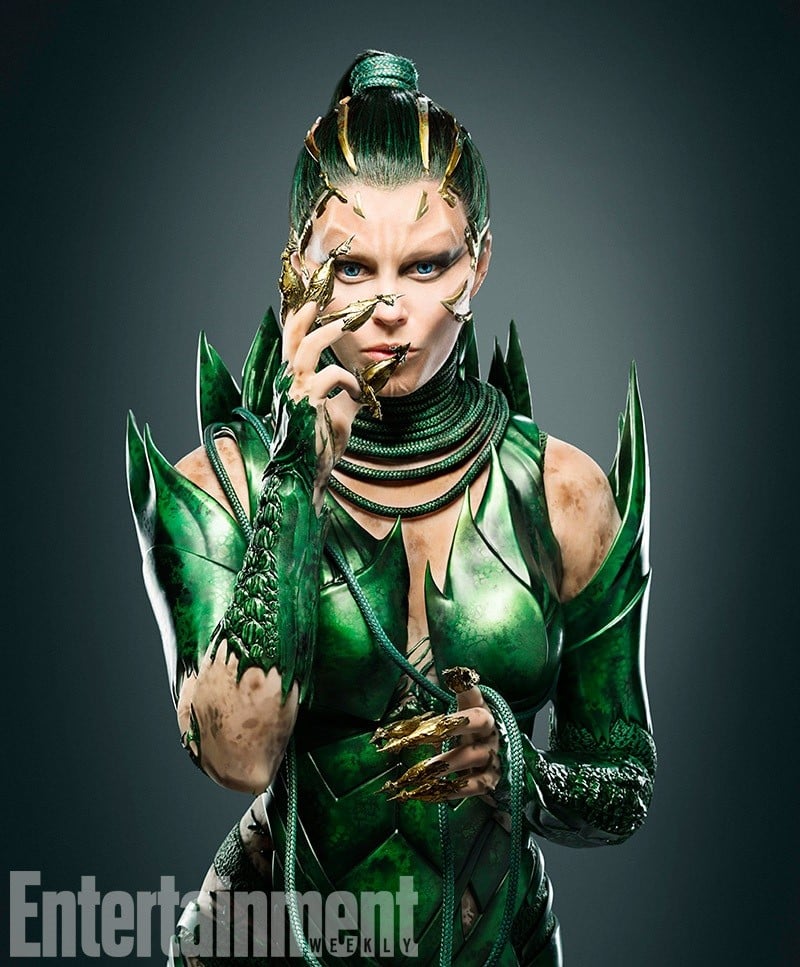
(Rita Repulsa, New. Source;
cheatsheet.com)
Now, let's talk about the villain - Rita Repulsa.
Now, the original Rita costume ...
(Rita Repulsa Classic, source:
thenerdist)
... honestly, looked ridiculous, and would look even more so by today's standards. All the new teens who weren't even born during the time of the original Power Rangers wouldn't stop making Lady Gaga 'jokes' which would be funny to no one but themselves. So while some might complain about it, I applaud their entirely practical removal. The new version lacks the gigantic collar and the horns which marked Rita's appearance. The collar would be difficult to translate into a modern form, so I don't begrudge them leaving that aspect out, and the horns would actually go against the look they're going for. (More on that below.)
If you read comic books, you might even think of her as a number of other green-clad sorceresses, including DC's Circe, Marvel's Enchantress with a new hairdo, or even a take on Morgana from Arthurian legend. At first glance, it doesn't much like Rita Repulsa. The second glance is not much better. But around the third glance, things begin to clear up around it.
One image they released shows her pining the unmorphed Yellow Ranger to a wall, suggesting that she's going to take on a more physical role, so it makes sense to redesign to be more combat ready and able to move around. Rita's original outfit does not lend itself well to for clear, concise fighting and heavy physical action. I would be one to criticize how it shows skin and maybe even sexualizes her in a way Rita never was originally, but I say maybe - because if you look at the exposed skin, it seems to have dirt and smudges and shapes on it, which implies she's been infected with something or stuck underground with nowhere to bath - which would certainly be accurate to the original story. And most people I know don't tend to think filthiness is attractive. So even the things I could complaint about the costume, I find they put in something to counterbalance with.
Granted, less sexualization of women in movies in general would be great, but I think this costume is
far from the worst example. Not with Harley Quinn over in Suicide Squad shaking herself while pulling a shirt over herself, while
everyone else present is already dressed. But I diverge from the topic.
(Update: in doing research for this, I've found a photo showing the costume from the back and it is
very flattering to Elizabeth Banks' rear. Still not as bad as anything in Suicide Squad, though.)
Rita's costume is also visually busy, but unlike the Rangers, not overly so. She has one solid color, which all of her patterns and details fade into instead of standing out against, and one accent color which is spread out in little doses.
The golden claw-tips by themselves, one might think it's just a way of including the classic 'femme fatale extended nail' look. I certainly did. But it actually goes deeper than that. It actually took me a good long time of looking at it to realize how deep they really went.
The costume is very, very green. Rita was involved in the Power Rangers story "Green With Evil," which introduced the popular and long-lasting Green Ranger, his Green Dragonzord, and if I recall correctly, was the first story to play around with the idea of the Rangers suffering a serious defeat. A series of (also very green) chains(?) are around her neck, and she intertwines them around her fingers like someone might a pet snake, alluding once more to the reptilian theme without being so unsubtle as to to just put an actual snake there.
Her vest crawls up on her chest and ends in a curved point, as does the top of her shoulder ... thingies, and the back of her clothing, rising up like
stegosaurus plates, which makes the costume look very saurian. Her gauntlets also have spines sticking out from the back of them which remind of nothing so much as the skin between a dragon's wing, and if you look closely, you'll see a pattern like scales set within the gauntlet, again evoking a dragon. But it's far better realized than anything the Rangers' costumes have done, because it's all one solid color, and the details in don't swerve all over the place. Because its the same color, it blends in, so it doesn't distract you and doesn't take you out of viewing it, because it's a detail which blends in and you can miss it easily, but doesn't cost from the design, and it's something you can appreciate if you just happen to look at it long enough to notice.
Finally, I'll note the golden bands on her head. They curve downwards and almost seem to be grabbing her head, like a dragon's claw, or maybe even a mouth.
The golden claws, snake-like chains, pointed ends on her gauntlets, and the golden bands in her hair all evoke the Green Dragonzord, which Rita gave to Tommy.
That's why it doesn't look much like Rita - because it looks like the Dragonzord.
(Legacy Dragonzord, source:
Amazon)
I could speculate she'll summon it at one point or turn into it or something, and given how much is clearly there in order to evoke the dragon imagery, I struggle to believe she won't do something with the Zord. At the very least, if she doesn't, I'll have to change my rating!
When all is said and done, the costume itself is well-designed, even if doesn't scream "Rita Repulsa," What puts it above the Rangers' designs is that it knows what it's going for. It knows what it wants to be, and dedicates itself to being that, regardless of what Rita looked like more than 15 years ago, evoking the Dragonzord without slavishly dedicating itself to recreating every bit of the robot. I have to wonder why these two costumes differ in approach so heavily once put under a microscope - did they have different people working on Rita's than they did on the Rangers? The Rangers suffer from trying to stick to the source material while also updating to a more modern-looking design, while Rita's completely sheds any pretense of trying to be the original and emerges as its own, fully-formed entity of a costume.
And for that reason, I rank it as a better costume than the Rangers.
Design Verdict:
Pretty Good!
Even if I still think it looks more like a modernized version of Divatox instead of Rita.